
Responsive Website Design Services
One Website. A Better Experience Across Devices.
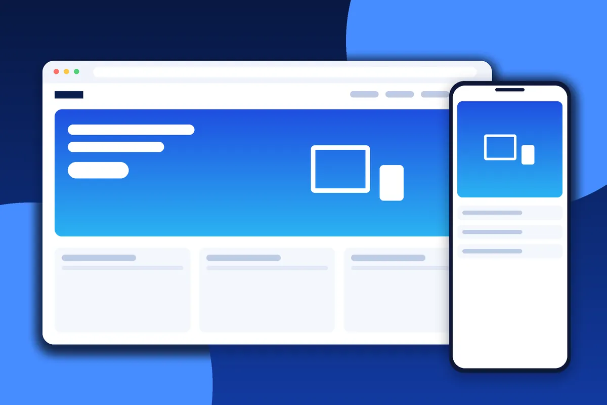
People visit websites using a variety of screen sizes, browsers, and devices. Responsive design helps your content and interface adapt to different viewing conditions.
We create responsive layouts that support readable content, usable navigation, accessible controls, and practical interactions.
Our Responsive Design Approach
Flexible Layouts
Use layouts that adapt to available screen space.
Responsive Images
Display suitable images at appropriate sizes for different devices.
Mobile Navigation
Make menus and important links usable on smaller screens.
Readable Typography
Use text sizes, spacing, and line lengths that support readability.
Touch-Friendly Controls
Provide appropriately sized buttons, links, and interactive elements.
Cross-Device Testing
Review key pages and interactions across representative screen sizes and browsers.
Why Responsive Design Matters
A responsive website helps visitors access information regardless of the device they use. It can also support usability and reduce the need to maintain separate desktop and mobile websites.
Responsive design alone does not guarantee high rankings or conversions; content quality, technical implementation, and user needs also matter.
What responsive design really means
A responsive website adapts its layout to the screen it is displayed on. Instead of building separate sites for phones, tablets and desktops, one set of pages rearranges itself using flexible grids, scalable images and rules that respond to the available width. The same content remains available everywhere, which simplifies management and avoids the confusion of visitors seeing different information on different devices.
People move between devices constantly. Someone may discover your business on a phone during a commute, revisit it on a laptop at work and complete a purchase on a tablet in the evening. If your website is awkward on any of those screens, you risk losing them at the moment they are most interested.
How we design for different screen sizes
We usually start with the smallest screen and build upward. Designing for mobile first forces decisions about what is truly important, because there is very little room for decoration. Once the essential content and actions work well on a phone, we expand the layout for tablets and desktops, adding columns, larger imagery and additional supporting content where space allows.
- Flexible grids that reflow content rather than shrinking it
- Breakpoints chosen according to the content, not specific device models
- Navigation that collapses into a clear, thumb-friendly menu
- Tables, forms and galleries that remain usable on narrow screens
- Readable line lengths and generous spacing at every size
- Layouts that adapt to portrait and landscape orientation
Images, video and typography
Large images are one of the main causes of slow mobile pages. We prepare images in modern formats and several sizes so that each device downloads an appropriate version rather than a huge desktop file. Dimensions are specified so that the page does not jump around as images load, and decorative images that add little value are removed on small screens.
Typography needs the same flexibility. Text should be comfortable to read without zooming, with sensible line height and contrast. Headings that look elegant on a wide screen can break awkwardly on a phone, so we adjust sizes and spacing across breakpoints. Embedded video and maps are set to scale within their containers instead of overflowing the page.
Touch, interaction and accessibility
Mobile visitors use fingers, not mouse pointers, which changes how interfaces should behave. Buttons and links need enough size and spacing to be tapped accurately, forms should show the right keyboard for each field, and menus must not rely on hover effects that do not exist on touchscreens.
Accessibility overlaps strongly with responsive design. Resizable text, logical focus order, keyboard-friendly controls and clear labels help people who use zoom, screen readers or alternative input methods. Our UI/UX design work covers these interaction details in more depth.
Testing across real conditions
Resizing a desktop browser window is not enough. We check key pages on representative phones, tablets and browsers, in different orientations and with realistic network conditions, and we test navigation, forms, search and any interactive features. Problems found in testing are corrected before launch.
If you already have a website that does not work well on mobile, we can review it and advise whether targeted fixes will be enough or whether a broader website redesign makes more sense. To discuss your site, visit our contact page.
Common responsive problems we fix
Many websites technically adapt to small screens but still offer a poor experience. The problems we meet most often include:
- Text that is too small, or lines that run edge to edge
- Menus that cannot be opened or closed reliably on touch devices
- Images that are huge on mobile or that crop important details
- Buttons placed too close together to tap accurately
- Forms that are difficult to complete on a phone keyboard
- Tables or embedded content that overflow the screen
- Pop-ups that cover the content and are difficult to dismiss
- Layouts that shift while the page loads
Each issue is small on its own, but together they push visitors away. Correcting them improves usability for everyone, regardless of the device they use. If you are not sure how your site performs, share the address with us through the contact page and we will review it.
Why responsive design matters to your business
A responsive website can reduce duplicated effort because you maintain a single site rather than separate desktop and mobile versions. It also helps visitors in a practical way: they can read your information, contact you and complete tasks wherever they are. While responsive layouts alone do not guarantee more enquiries or better rankings, they remove a common source of frustration and support an overall better experience.
We recommend reviewing how your visitors actually browse. Analytics can reveal the share of mobile traffic, the screen sizes that matter most and where visitors abandon pages. Those findings help us prioritise design effort where it will matter most.
Frequently Asked Questions
Will my website work on mobile phones?
We build responsive layouts and test the relevant pages across representative screen sizes.
Can you make an existing website responsive?
Yes. We can assess your existing design and determine whether targeted changes or a broader redesign is more appropriate.
Does responsive design improve SEO?
A mobile-friendly experience supports good technical and user experience practices. Rankings also depend on many other factors.
Create a Responsive Website
Make your website easier to use across devices.
Discuss Your Website Requirements